MKHNewBrandIdentity2025.pdf
Open in new tabHaving trouble viewing? Open the PDF here.
The Meaning Behind the Mark
1
Logo Rationale: Strengthening MKH's Identity Through Meaningful Design
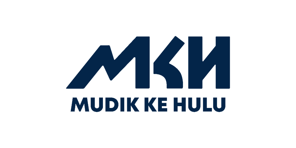
The new MKH logo is more than just a visual refresh. It is a strategic rebranding effort to communicate MKH's values, mission, and direction in a powerful and unified way.
- Every element in the design carries intentional meaning.
- Designed to reflect our commitment to transformation.
- Support, and spiritual growth.
2
Why This Change Matters?
The rebrand moves from the previous colourful identity to a bold, modern navy and green mark.
- Stronger Brand Alignment: The new logo better reflects the heart of our work and speaks directly to our audience, those seeking meaningful change.
- Greater Impact: It creates a visual identity that is memorable, emotionally resonant, and symbolically powerful.
- Future-Ready: This rebranding positions MKH to grow into a modern, visionary initiative and embracing digitalisation, while staying rooted in our core values.
3
The Color: Navy Blue as a Mark of Trust
The use of navy blue is deliberate, chosen to communicate specific qualities central to MKH's mission.
- Trust, Loyalty, Sincerity, & Depth: The use of navy blue is deliberate, associated with these qualities.
- Emotional & Spiritual Safety Net: It communicates the dependable nature of our services and the safety net MKH provides.
- Empathetic & Authentic Program: This color reinforces MKH's identity as dedicated to supporting each individual on their journey.
4
The 'M' – Choosing the Right Path
The 'M' in the logo carries deep symbolic meaning tied to MKH's core value of Muhasabah.
- Upward and Rightward Movement: Illustrates a journey toward improvement, a conscious decision to change, grow, and heal.
- The Hijrah Journey: Symbolizes a spiritual migration towards something better. It visually represents MKH as a beacon of progress and spiritual renewal.
- Core Value of Muhasabah: A reminder that meaningful change begins with sincere self-reflection and the courage to grow from within.
5
The 'K' – Rising After Hardship
The 'K' reflects resilience and the process of overcoming adversity.
- Upward Curve of Resilience: Represents resilience and rebirth after personal trials, symbolizing an upward trajectory.
- Overcoming Adversity: Directly connects to MKH's work of assisting individuals in overcoming emotional, social, or spiritual adversity.
- Safe Space and Companion: Positions MKH as a safe space and a trusted companion in the healing process.
6
The 'H' – Stability and Faith
The 'H' anchors the logo, representing groundedness and faith.
- The "H" stands tall and firm, reflecting groundedness, strength, and stability.
- It anchors the logo visually and symbolically in faith and purpose, two values central to MKH's ethos.
- It also assures our stakeholders that MKH is reliable, trustworthy, and principled in our approach and programs.